Your font choice can affect more than just the appearance of your design. The right typeface will enhance the message that is being communicated. If you choose a poorly-chosen font, however, it could have exactly the opposite effect.
If you’ve ever wondered why the typeface is so important in design, this article will give some insight. Here are 12 times your fonts made your design better:
PHOTO CREDIT: @
Your logo and your identity
A good logo is an important part of a successful business. Luckily, typography plays a big role in making your company logo recognizable and unique. The font that you choose for your design should be just as memorable as the illustration or graphic that dominates the image. Even if your company’s logo does not include any text, such a font choice should be carefully considered, as it will play a role in the company’s overall identity.
Finding it hard to find fonts that will fit your brand? Go to CreativeMarket.
The title of your book
The title can make or break a novel. In fact, many publishers say that the cover design sells books more than any other aspect of marketing materials. It is also important to consider fonts when you are writing your novel. There are many fancy fonts that can be used in creative ways when writing. Something as simple as changing the font size, color, or placement can really change the feel of your story.
A successful poster
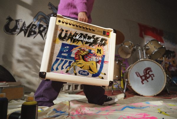
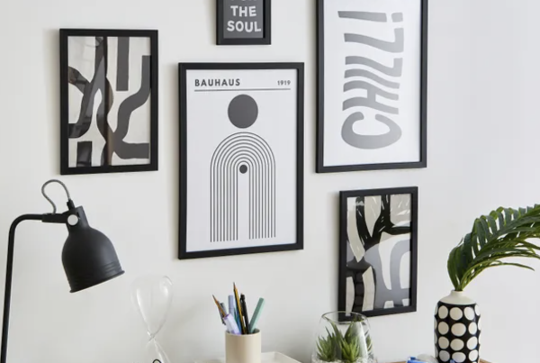
There are few things more effective than a well-designed poster. The right combination of fonts, colors, images, and graphics can drive home the message you are trying to communicate. This is why it is so important to choose your font carefully. You want it to be visible, legible, and recognizable without taking too much away from the other elements on the poster.
The “About Us” section of your company website
The first place that potential clients will go when they visit your company’s website is usually the “About Us” or “Our Story” page. This is where people usually learn about who you are as a company and what services you provide. It helps give visitors an idea of the personality of your business. Not only should the words that you use be clear and professional, but so should your font choice. You want a font that represents who you are without being over-the-top or hard to read.
A blog post on your website
Many businesses have a blog section on their websites where they share news, information about services, and advice for consumers in an industry related to yours. When writing these posts, it is important to remember that not everyone reading them will be familiar with what you do or the terminology that is associated with your work. Using fonts like Arial, Helvetica (or any of its generic sans serif cousins), or Verdana ensure readability and make reading pleasurable for your audience.
The heading of your resume/CV
The heading of your resume or CV is what catches the eye first. It is very important, therefore, that it is designed well with appropriate fonts and colors to match the job you are applying for. The choice of font should be crisp and clear without being too ornate or flowery, as this will only take away from the rest of your design elements. You want to create a professional looking document that lets people know you mean business.
A memorable slogan
A good slogan can stick with a company forever and outlive even the most famous logos and brands. This is why it is so important to choose a font aesthetic that represents both where your brand began and where you are headed. The font you choose should be memorable, easy to read, and make sense for the message you are trying to convey. Slogans written in Comic Sans or Papyrus will only leave people scratching their head or giggling at your design choice.
Your annual report
Every year, companies produce an Annual Report that represents how well they have done as a company over the past year. These documents use graphs and charts to explain business activities from month-to-month throughout that time period. When it comes to making choices about what type of serif or san serif fonts should be used on these reports, going with a classic font is always best – something like Times New Roman works well here.
The font of your business card
Your business card should be simple and easy to read. Fonts can make a huge difference in how well your business card can communicate information about your company. So don’t be content with free fonts; go for those that are striking and reflect the type of services you provide and who you are as a person.
The font used on your company’s letterhead
Designers should always consider the overall look of their printed documents when choosing fonts. This is especially important when your company uses a letterhead to communicate important information about its mission, vision, and value proposition. Your choice of font will say a lot about your company and the messages you send to customers.

The font on your brochure or flyer
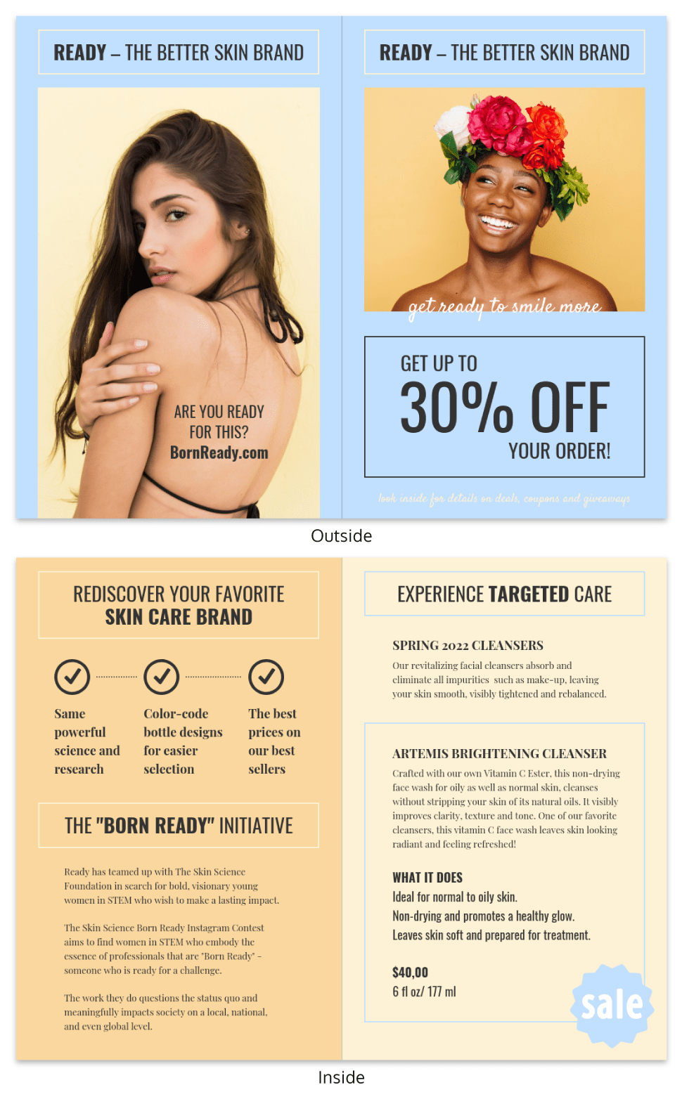
Brochures and flyers are effective marketing tools because they have convenient shapes and sizes for displaying inside of businesses, on countertops, and in mailboxes. However, it is important to remember the importance of the right font style when designing your brochure or flyer. Your choice in font can communicate a lot about you and your business, so choose something that fits your organization’s identity and mission.
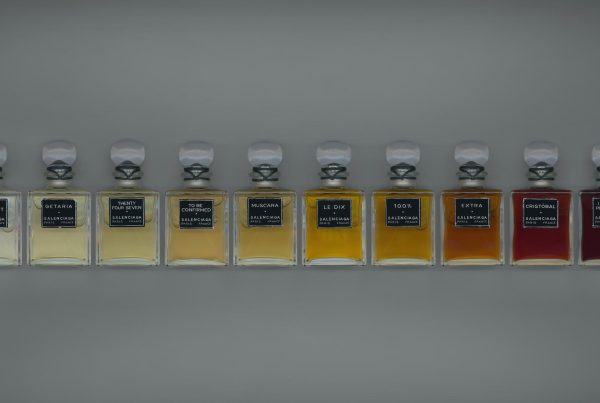
The label of your product
Fonts are very important when it comes to labeling products, so you need to choose the right font for your marketing materials. Fonts automatically create an impression about what is being sold, which means that marketers should consider their choices carefully. For example, serif fonts are often used on food packaging because they communicate that the food is healthy and natural.
Bottomline
Choosing a font for your design is more important than you might think. A poorly chosen font can communicate exactly the opposite of what you intended. There are many aspects to consider when choosing a typeface, and most designers will disagree on which fonts fit best with specific designs or words. However, if they all agree on one point, it’s that each font has its own unique personality and those personalities should be present in your work as well.


