


![BeFunky-collage]]] – 2026-06-19T170114.800](https://pausemag.co.uk/wp-content/uploads/2026/06/BeFunky-collage-2026-06-19T170114.800-600x403.jpg)


![BeFunky-collage]]] – 2026-06-03T215133.336](https://pausemag.co.uk/wp-content/uploads/2026/06/BeFunky-collage-2026-06-03T215133.336-600x403.jpg)


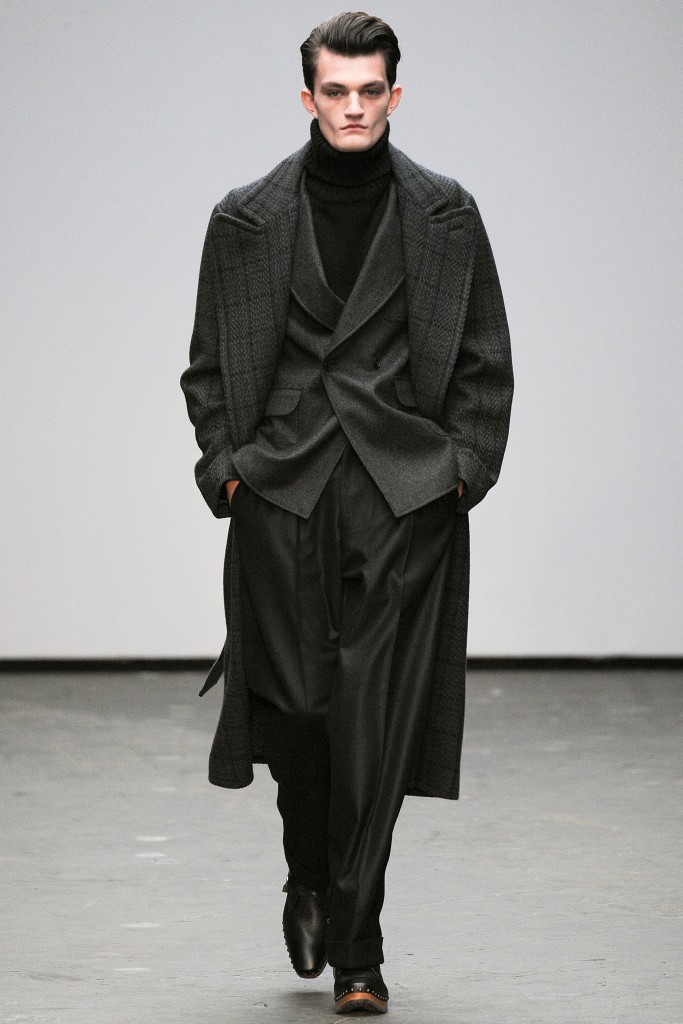
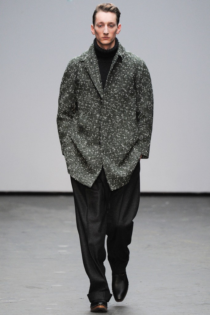
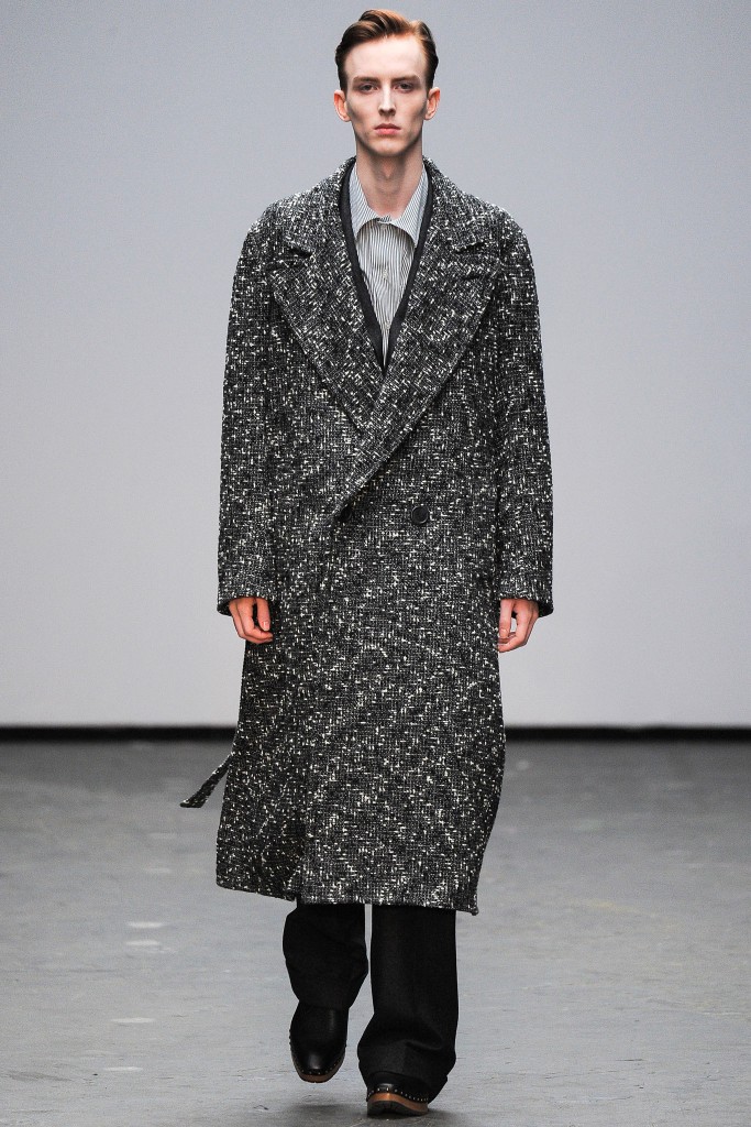
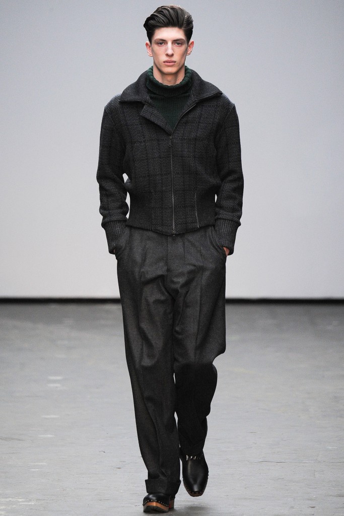
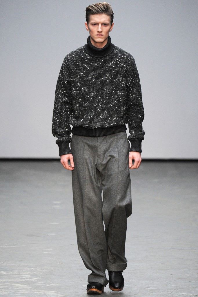
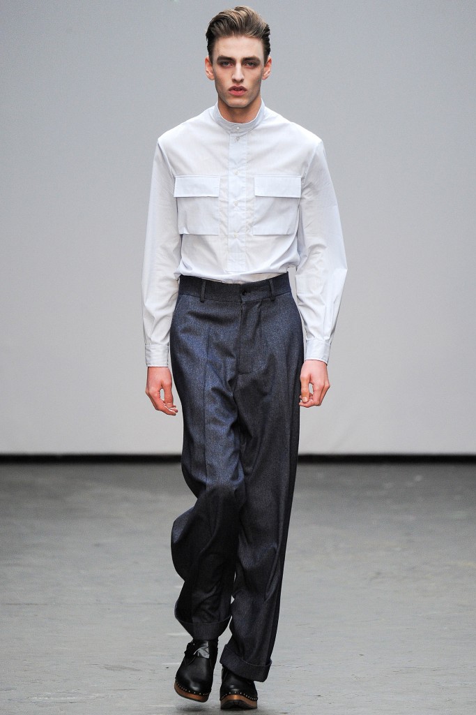
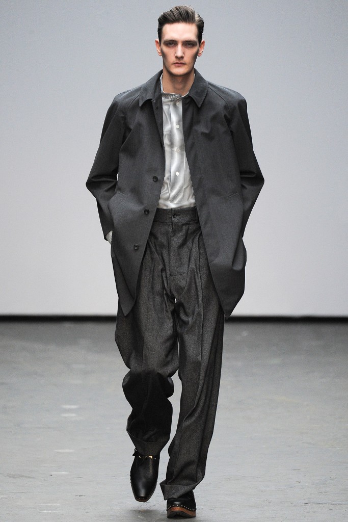
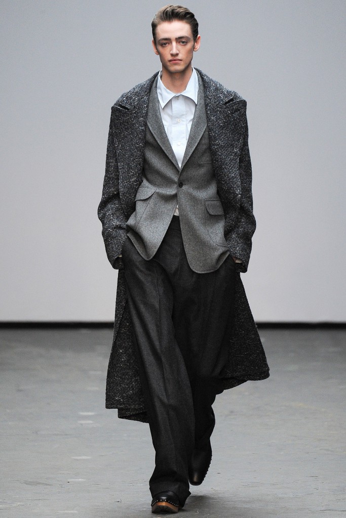
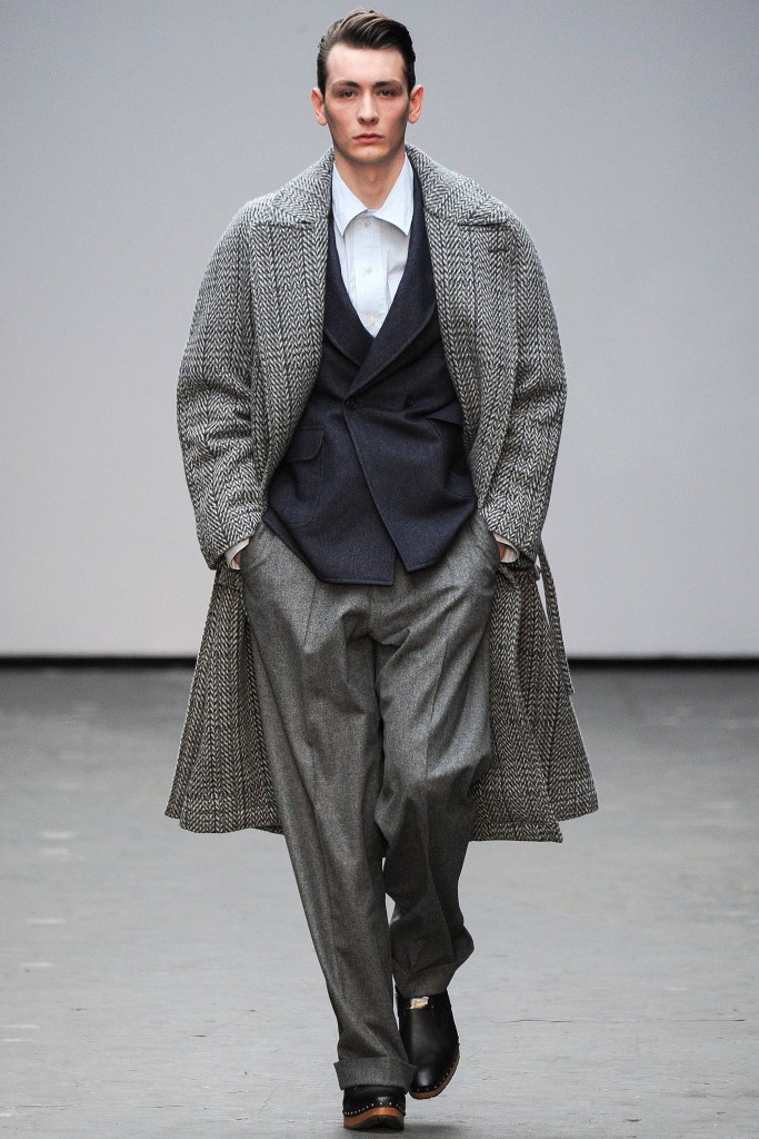
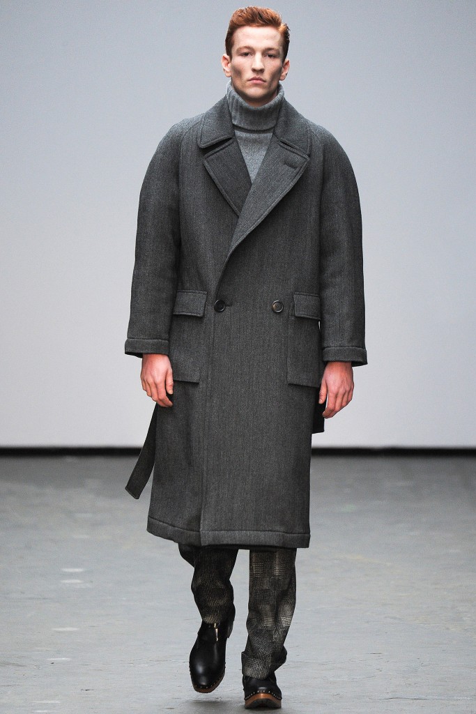
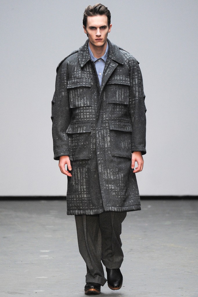
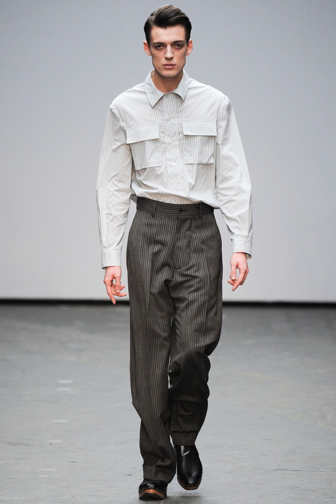
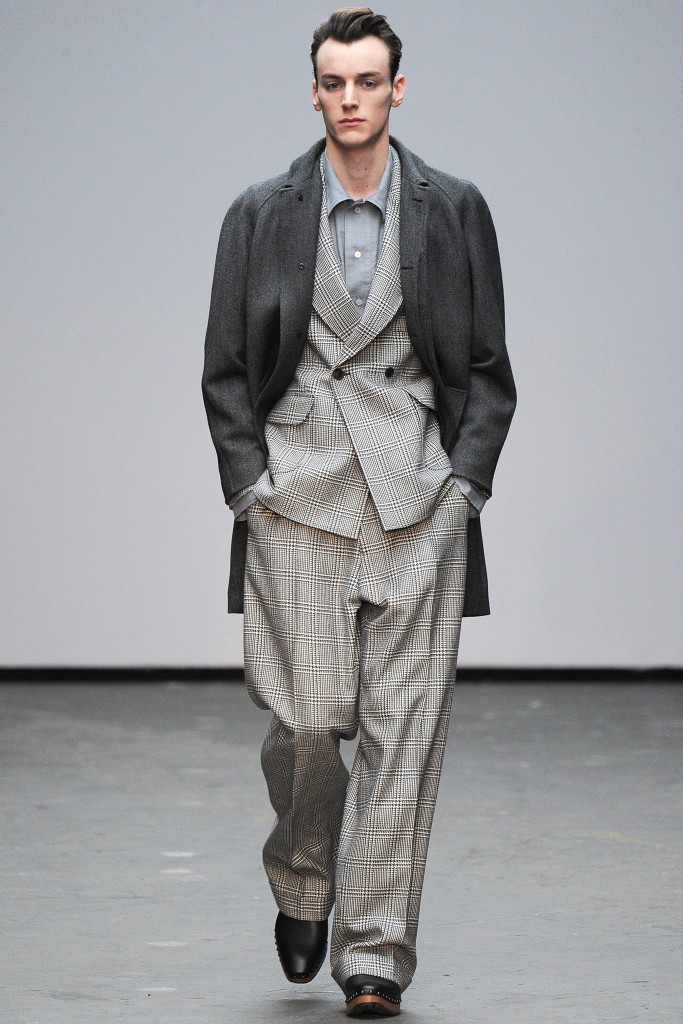
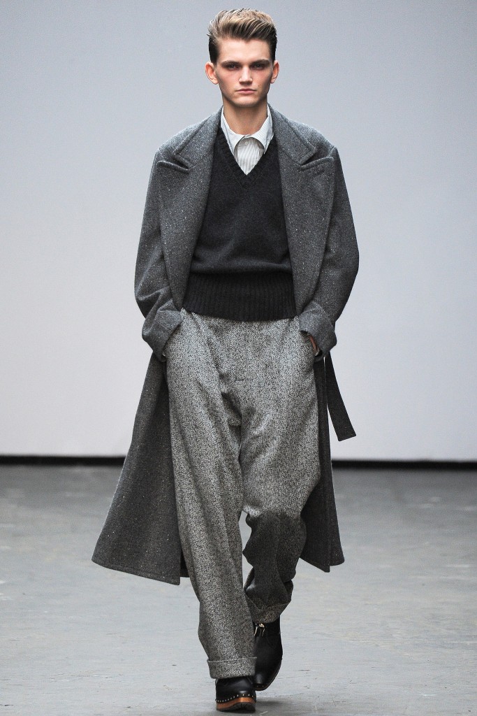
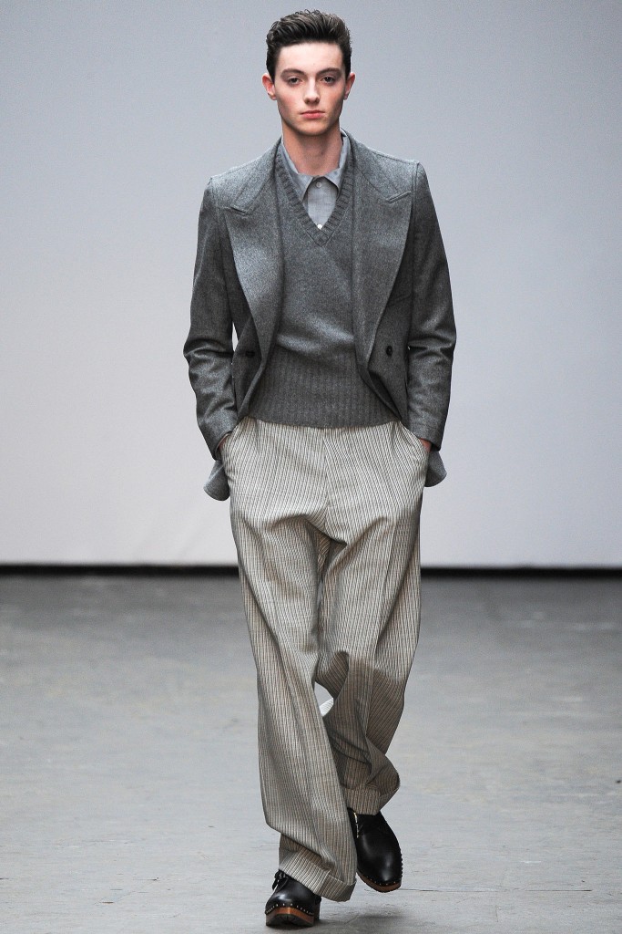
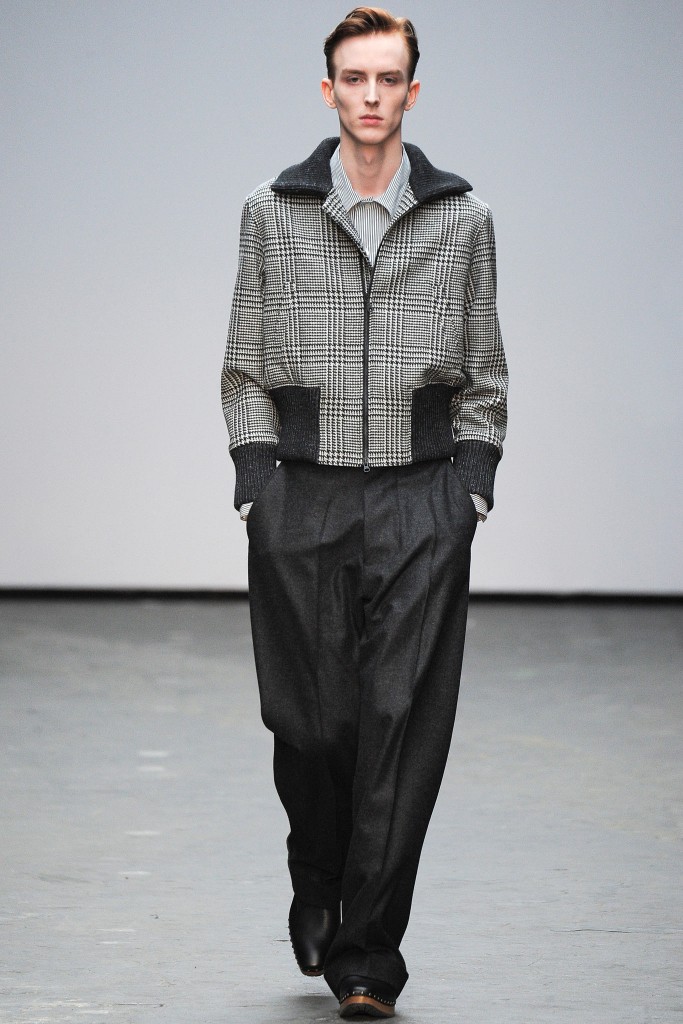
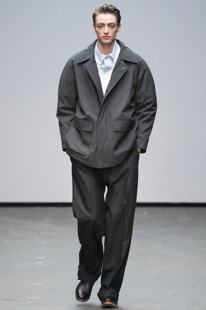
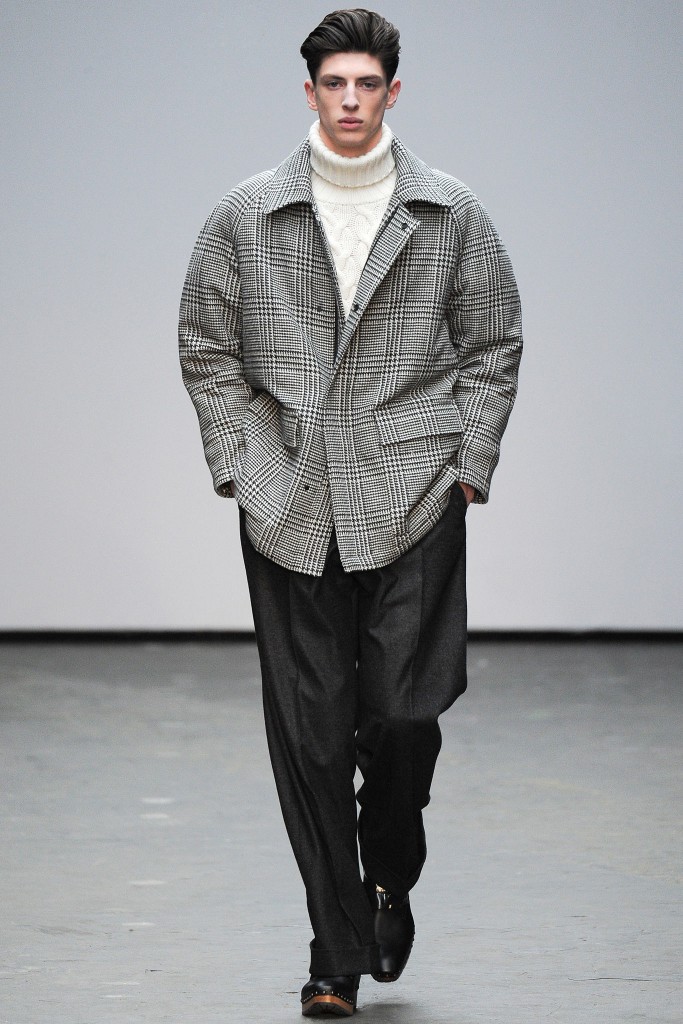
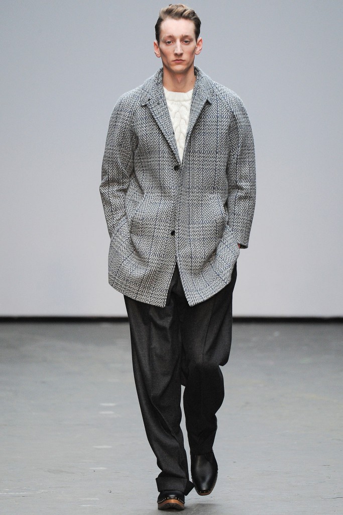
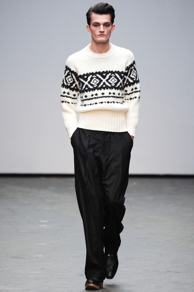
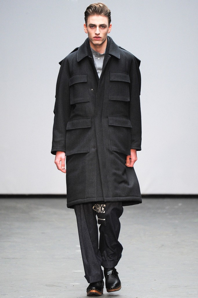
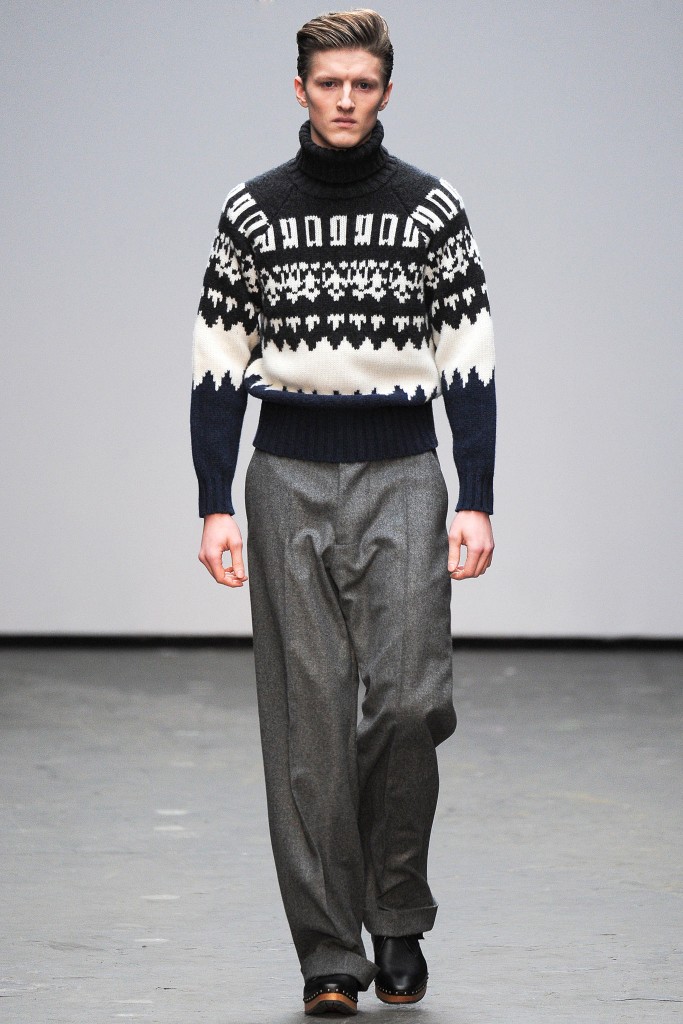
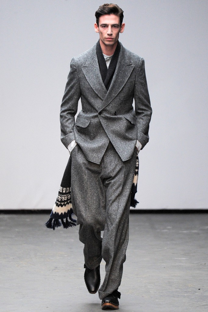
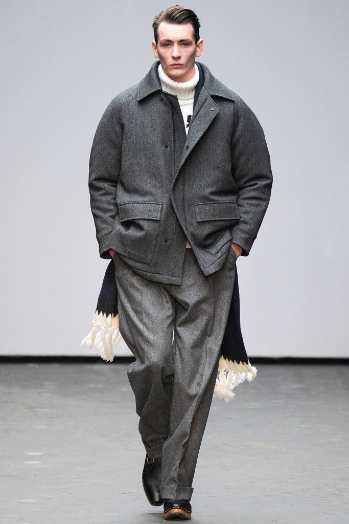
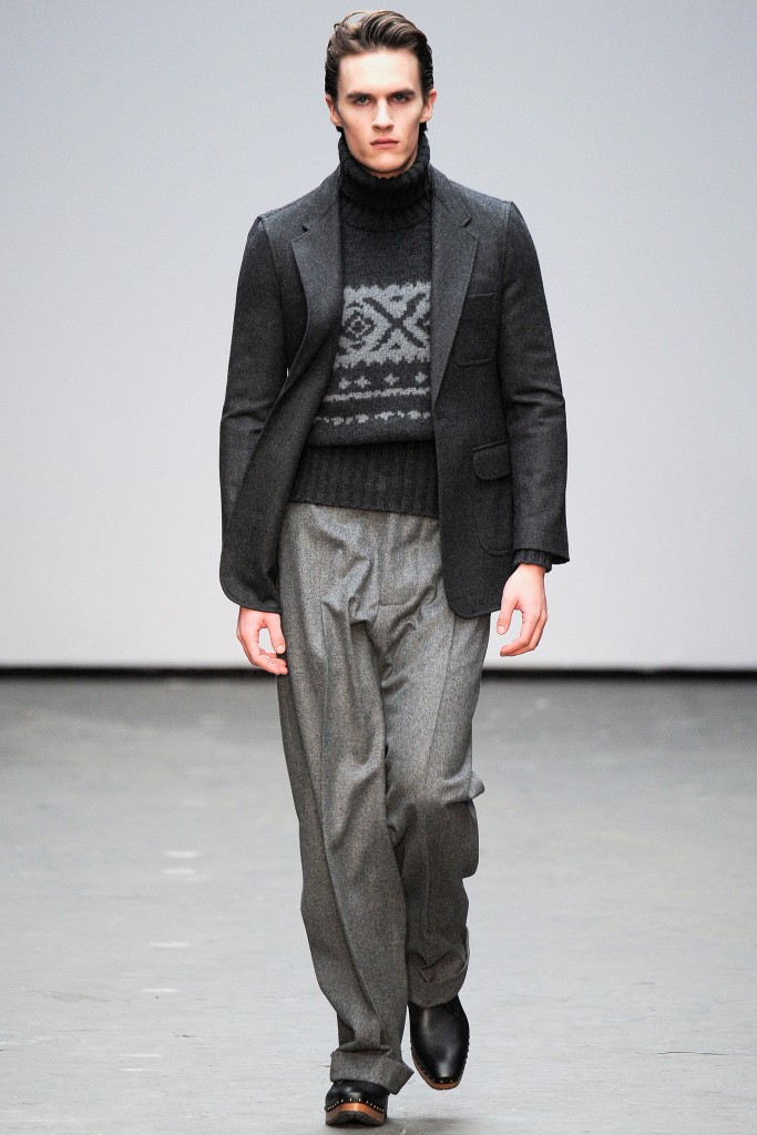
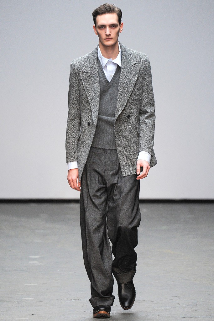
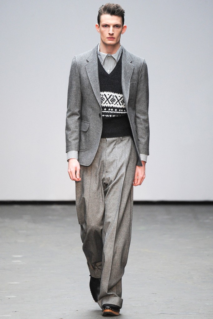
E.Tautz presents oversizing classics for effortless AW15 looks.
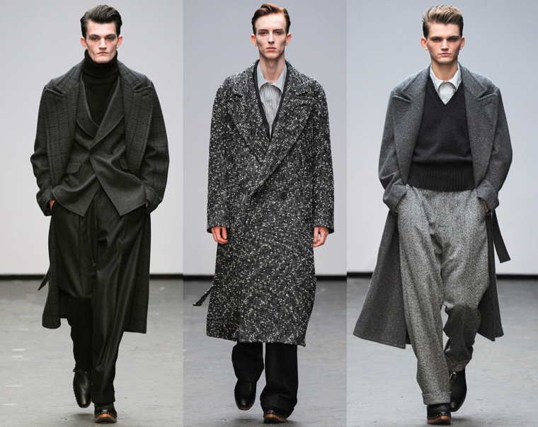
Founded in 1867, London-based tailoring brand, E.Tautz, has been standing strong season after season. Showcasing their Autumn/Winter 2015 collection at London Collections: Men, E.Tautz delivered strong sartorial soft tailoring in shades of grey. Our Editor-in-Chief, Johnson Gold, got the chance to interview the Creative Director of E.Tautz, Patrick Grant, at the Braun x E.Tautz video screening. Patrick talks about the AW15 collection, inspirations behind the aesthetics and the design process from season to season.
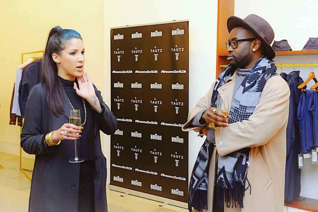
Editor Johnson Gold (Right), Fashion Editor Samantha Ria (Left)

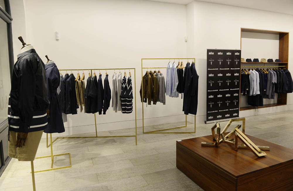
Screening of E. Tautz AW15 show with Patrick Grant sponsored by Braun.

Creative Director of E.Tautz, Patrick Grant.
You showcased E.Tautz Autumn/Winter 2015 collection at LCM which featured shades of grey, why did you choose this colour?
The really honest answer (laughs); I think it just looks really nice. We did a lot of colour in the Autumn/Winter 2014 collection, lots of very bright, Onate clothes with a lot of jewelling, and I just wanted something that was really simple, sort of easy chic.
Why not black or white?
No, I never really wear any black. We’ve done black clothes in the past, but we’ve always done black clothes with brighter colours with them. I think when a collection is all black it just feels very flat. Black cloths never really look very luxurious. Black knits can I think, but black woven doesn’t.
So what is the difference between grey and black aesthetics? What does that bring?
Well, there’s so much more depth, most black cloths are very flat. If you look your scarf, it’s very uniformed but all of the greys are very rich and deep, there’s a depth to all of the colours that you get with grey. So you get all of that marbling effect which just looks richer and more luxurious, and really very expensive black fabrics looks very flat. Same with navy blue on the whole, is it hard to get a navy blue that looks as rich as grey. It is also very forgiving on an Anglo-Saxons complexion. Black is great for Italians who have a richer skin tone than us pale rosy cheeked Brits and grey just helps us.
You said the collection was inspired by poems, could you tell us more about these poems?
Well it is a series of poems; it’s a book Terry Street by a poet called Douglas Dunn and he lived in Hull, on a street called Terry Street. He wrote poems about the people that he saw and the things that were going on; people walking home drunk from the pub, men walking to work in the morning, drunks spilling out of [you know], just the comings and goings of a working class neighbourhood.
How did the poem translate your mind into designing the new collection?
Reading the poems, they created a very vivid picture in my mind of the clothes that we saw, there was something… I guess I read allot. I read a lot of history look at a lot of photo books and watch loads of documentaries and films from the BFF (The British Forces Foundation) Archive. I spent a lot of my time in that part of England; I lived in the South of County Durham. I lived in Leeds, Manchester and Liverpool. I have observed a lot from living up there and those poems bought back a sense of something that was very vivid to me. And then we used the photos of John Bulmer, who photographed all of that area in that period and those photographs are all beautifully shot. They were all in black and white; there is a lovely richness, a sort of foggy, sutty and slightly depraving. The building were slightly crumbling, there was just that very lovely highly textured aesthetic. It was all literally a shade of grey but within each grey there is texture, pattern and little bits of colour.

Photo by John Bulmer
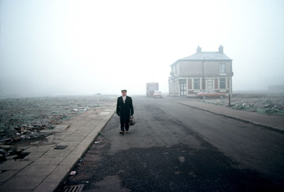
Photo by John Bulmer
The AW15 collection featured long grey coat with grainy details, such a strong statement classic, why the long coat?
It sort of is a continuation of my favourite look from the spring 2014 collection, which was a very simple look. If you’ve watched Withnail & I, he’s got that amazing long coat which just flows and that is my favourite look from spring. I really like the simplicity of it, it just had that sort of beautiful elegance, and it was a very chic look. It was very simple; it was a pair of jeans for goodness sake. It just had a certain chic to it and I wanted to carry that on, that idea of that softness. A lot of tailoring in London for the last few years has been very strict, sharp and definite; I just wanted to soften it. Also I’ve been wearing beautifully cut and fitted Savile Row constructive suits and I love wearing them, and when you wear them it makes you stand up straight, sucks you in.

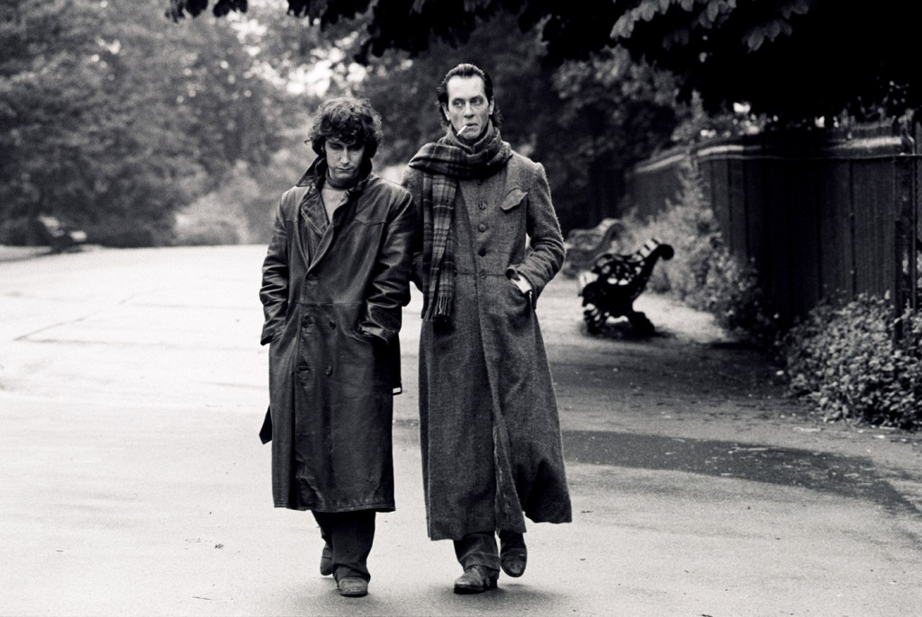
Withnail & I
It gives you a sort of confident personality?
Yeah, and I just find that I’m yarning for something softer and easier to wear and something that makes me feel different when I’m wearing it. If you love clothes you’re always looking to evolve the way you dress and the clothes make you feel a certain way, and these clothes are just about managed to squeeze into some of the trousers and the coats are just so lovely to wear.
Can you give us a tip on how a man should dress simple and look effortless…
If you are going to wear very little, the things that you wear brought to be very good. If you’re just going to wear a nice pair of trousers and a shirt, the shirt needs to be beautiful, it needs to fit, it has to have something about it. The trousers need to be beautifully cut and have great fabric. Whatever it is that it needs to be, if you’re going to wear very little it needs to be very beautiful things. Treat them very sensibly and straightforwardly. If you buy a nice overcoat, you don’t need to do too much to it, it should do all the talking for you. So that’s it, keep it really simple and buy fewer but better things.
As a designer, the pressure of finishing a collection and having to work onto the next continuously season after season. How early do you guys design pre-ahead?
We finished designing this collection a while ago and as soon as we finish one, we start working on the other.
When did you finish Autumn/Winter 2015 before you guys showcased it?
Well, all the pieces pretty much everything was made just before we broke for Christmas. Every piece that was in the show, as it’s made to be fitted and done. And that is a long season as it is a seven month season; this upcoming season is a five month season.
How do you find designing towards the spring season?
Well you just have to be quick.
Do you feel as if there is much more thought process into Spring/Summer rather than Autumn/Winter?
Well winter is easier, because you just have more to play with. Spring is fun because, A it’s a quicker season and I like them both equally but for English brands traditionally, a lot of them are not so hot on their summer and winter is when they are strongest. I think practically because we now that we now sell globally, there are plenty of countries that we sell to that don’t have a winter. So we need to be doing good at spring, and I think we’re finally working on how to be good at spring, without doing stuff that doesn’t feel like it comes from E.Tautz, every has to feel like it comes from us.
Interviewed by: @Johnson_Gold
See the full Autumn/Winter 2015 collection below: