










Raised lettering changes the outline of a graphic as well as its surface. The space inside a letter, the distance between strokes and the way a word bends across the chest all deserve attention before a designer asks a custom streetwear manufacturer to add more height. A word that loses its shape has lost part of the design, however striking the texture looks up close.
For a label developing dimensional graphics, Jiashun Clothing offers puff printing, foam-backed embroidery and chenille directions. These create different surfaces. Choosing among them starts with the mark itself: the parts that must remain recognisable, the scale at which it will be worn and the feeling the designer wants someone to notice.
Start With The Spaces Inside The Lettering
Open the artwork at its intended garment size. Large working files can make a narrow gap look generous, particularly when the designer keeps zooming in to tidy the edges. Print a paper version at actual size and hold it against the proposed top. The paper cannot reproduce texture, but it can expose a word that is already too crowded before any raised process is added.
Look at the internal spaces in letters such as R, B and e. Then look at the gaps between neighbouring characters. Those spaces help the reader distinguish one letter from another. If a small opening is essential to the mark, ask whether the production sample preserves it. Avoid fixing a crowded word by asking for more relief: that request concerns height, while the unresolved problem concerns the outline.
The designer has several possible responses. The word could become larger, the spacing could open up or a small detail could move into a flat part of the composition. Each changes the visual identity in a different way. A designer should choose the compromise deliberately, rather than let an unexplained sample adjustment become the new logo.
A dense monogram provides a useful counterexample. It may work as flat artwork at a small chest position and become unreadable when its narrow separations disappear in the physical treatment. That does not establish that the whole technique is unsuitable. It establishes that this version of the mark needs another scale, another outline or another treatment. Reject the version for the observed problem.
How Raised Ink And Stitches Change Lettering
With puff printing, heat expands a suitable ink into raised relief. Foam-backed embroidery builds height with stitching over foam, while chenille creates a yarn-pile texture. These differences affect the visual language of a graphic: a rounded ink surface, visible thread and a soft varsity-style pile communicate different things even when they follow the same letter.
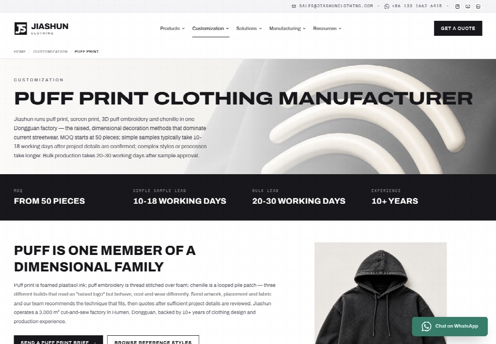
Jiashun Clothing reviews the artwork with the intended fabric and can adjust the proposed method during development. That discussion is more useful when the designer names the desired effect. A soft-edged inflated word and a sharply outlined stitched badge call for different decisions. Sending one reference photograph with the instruction to make it three-dimensional leaves too much unresolved.
Give The Main Word And Small Details Different Jobs
A composition does not need the same treatment everywhere. The main word may carry the raised texture while a small date or secondary line remains flat. This can preserve the hierarchy: the texture attracts attention and the smaller line provides information once the viewer gets closer. Before adding a second process, ask whether that extra information contributes enough to justify the additional development.
Suppose a front graphic includes a bold word above a fine illustration. Making both equally raised could remove the difference in emphasis that made the drawing work. Another version might keep the illustration flat and use relief on the word alone. Compare the two designs on the same garment colour and at the same scale so the review stays focused on the treatment.
There is a cost to requesting many alternatives without a question to resolve. The supplier can produce a succession of changes while the label remains unsure what it prefers. Write the question before requesting another version: preserve the inner opening, reduce the visual weight or keep the secondary line readable. A specific decision makes the next sample more useful.
Let The Garment Move Beneath The Graphic
A flat mockup holds the design in an ideal position. On a person, the fabric folds and the word follows the garment. Inspect where the graphic sits when the wearer reaches forward or puts on an outer layer. If a fold cuts through the most distinctive letter, changing the placement may do more for recognition than increasing the print’s height.
Fabric surface also matters. A raised mark does not look identical against a smooth jersey and a brushed surface. The background texture can reduce the visual separation the designer expected. Review a physical example on the proposed cloth before approving a close-up image as evidence for the final effect.
Inspect The Inside As Carefully As The Front
Turn the garment over and examine the area behind the decoration. Put it on in the way the intended customer will wear it, with or without another layer underneath. If a stitched treatment feels intrusive at that location, report the contact point rather than describing the entire sample as uncomfortable. The supplier needs to understand whether the concern involves placement, backing, construction or the chosen decoration.
A chest mark and a sleeve mark may encounter different contact during ordinary wear. A bag strap, a jacket and a bent arm create useful situations to review. These are proposed wear checks, not evidence that a particular sample has passed. The aim is to find an objection while changing placement or technique is still a development decision.
Keep the assessment proportionate to the design. An occasional statement piece may have a different intended feel from a tee meant for repeated daily wear. That choice belongs in the brief. It should also remain visible in the final sample review, rather than being forgotten when the front looks impressive.
Resolve Washing And Care Before Adding More Texture
A faded garment with crisp lettering makes a different promise from one whose graphic also looks worn. When discussing the design with a custom t shirt manufacturer, specify which effect should remain sharp and which should look aged. The print and wash sequence needs to support that choice, and the approved sample should show the resulting combination.
For mixed decoration, Jiashun Clothing plans the process sequence around the puff treatment and includes a care warning against ironing the print. Carry that instruction into the product’s care information. A shopper should not have to discover a care requirement by damaging the graphic while pressing the shirt.
Consider the experience the product is asking for. If a label presents the tee as easy everyday clothing, its team should understand how the proposed decoration fits that use. A care requirement does not automatically disqualify the design. It does need to be clear enough for the customer and the staff handling the garment.
The same applies to a proposed wash adjustment. A designer may prefer a stronger faded surface after seeing the first garment. Before approving the change, ask which part of the graphic needs another check. Keeping the same artwork file does not prove that a different finishing route produces the same edges, colour or feel.
Give the next review a narrow purpose. If the main word is approved and only the secondary line needs attention, preserve that distinction in the comments. Reopening the entire composition can create unnecessary rework and leave the team choosing between versions with several unrelated changes.
Keep The Lettering Recognisable After The Texture Changes
The strongest raised graphic gives the wearer a clear mark and a deliberate surface. It leaves enough space for the letters to read, sits where the garment can move and feels appropriate to its intended use. Extra height should earn its place within those decisions.
For a sample review with Jiashun Clothing, bring the original artwork and identify the features that must survive the treatment. Use the finished garment to decide which details need height and which work better flat. Approve the word people will recognise and the shirt they will wear, including the details a close-up of the front cannot show.