






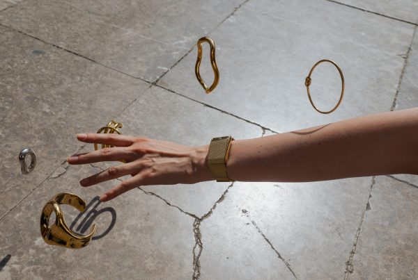

 Jewelry is one of the most expressive parts of personal style. A ring can make a quiet outfit feel deliberate. A necklace can change the balance of a simple neckline. A sculptural bracelet can say as much about a look as the clothing around it.
For independent jewelry labels, however, creating a strong collection is only half the job. The other half is showing each piece in a way that makes its scale, finish and character immediately clear on a screen.
That challenge has become more important as discovery moves between online stores, social feeds, editorial features and marketplace listings. A customer may first notice a ring in a street-style image, compare it through a close-up on a product page and finally return through a cropped social post. The product has to remain recognisable throughout that journey.
The AI Jewelry Photo Generator organizes model try-on, close-up, product-angle and lifestyle images into one listing workflow.
One Piece, Several Visual Jobs
The old ecommerce formula was simple: photograph an item against a plain background and upload the image to the store. That clean product shot is still essential, but it can no longer carry an entire campaign.
A modern jewelry launch may need:
- a clean hero image for the product page;
- detail views that show stones, links, clasps and surface texture;
- worn images that communicate scale and proportion;
- styling images that place the piece within a complete look;
- vertical crops for social media;
- consistent thumbnails for collection and marketplace pages.
These images are not interchangeable. The hero image makes comparison easy. The close-up supports confidence in craftsmanship. The worn image answers questions about fit. The editorial image creates desire.
The most effective brands assign a clear job to every visual instead of asking one photograph to do everything.
Scale Is Part of the Design
Jewelry is unusually difficult to judge online because a small difference in size can completely change its character. A 3 mm chain and a 7 mm chain may share the same silhouette, yet they create very different looks when worn. The same applies to the width of a ring band, the drop of a pendant and the profile of a cuff.
Measurements help, but most shoppers do not instinctively visualise millimetres. Worn imagery translates those numbers into something more immediate. It shows where a necklace sits against a collar, how much space a ring takes up on the hand and whether a bracelet reads as subtle or statement-making.
For jewelry styling, proportion matters. Each piece needs to work with necklines, sleeve lengths, other accessories and the overall balance of an outfit. A useful visual campaign makes those relationships visible.
Keep the Product Consistent Across Every Image
Variety is valuable only when the product remains accurate. If the shape of a stone changes between images, a chain becomes thicker, or the metal shifts from warm gold to pale yellow, the gallery stops building trust.
Independent brands should create a simple visual reference before producing a campaign. Record the details that must not change:
- stone shape and setting;
- metal colour and finish;
- chain pattern and thickness;
- clasp and fastening details;
- engraving or surface texture;
- relative size when worn.
Every finished image should be checked against that reference. The review is especially important when a brand combines studio photography, retouching and AI-assisted image production.
The goal is not sterile uniformity. Lighting, pose, setting and styling can change. The piece itself should not.
Use AI to Expand a Shoot, Not Replace Judgment
AI-assisted visual tools are giving smaller labels more ways to develop campaign assets without organising a new shoot for every crop, model or channel. The practical advantage is not simply generating more images. It is creating a broader visual system around a real product.
A jewelry-specific platform such as AI Jewelry Model can help sellers turn an existing product image into model photos, clean product views and coordinated listing assets. That can be useful when a small team needs to prepare several visual roles for a launch while keeping production manageable.
The same approach becomes especially useful when the product story depends on a coordinated look rather than one isolated piece. An earring stack generator can turn separate product photos of studs, hoops, huggies and cuffs into one model image, helping shoppers understand spacing, scale and how the pieces work together.
The source image still matters. It should be sharp, well lit and honest about the product. Generated results also need human review. Teams should compare the result with the original piece, inspect small details at full resolution and reject anything that changes the design.
Used this way, AI becomes part of art direction and production rather than a substitute for either. It can extend a strong visual idea, but the brand still decides what feels credible, stylish and true to the collection.
An ear stack workflow can combine separate studs, hoops, huggies and cuffs into one coordinated model image.
Build the Campaign Around a Styling Point of View
Accuracy creates confidence, but styling creates identity. The strongest independent jewelry campaigns do more than place a product on a model. They show how the piece belongs within a particular world.
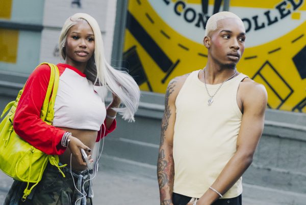
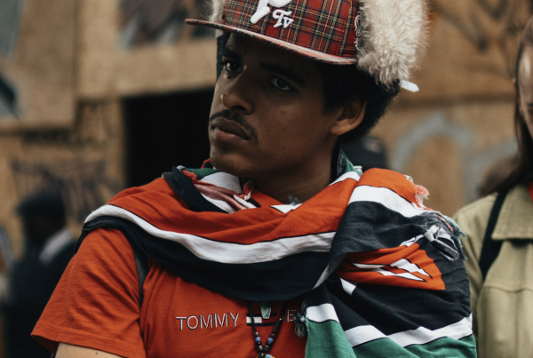
A minimal silver collection might be photographed with clean tailoring, monochrome knitwear and hard architectural light. A heavier streetwear line could be paired with washed denim, leather, sportswear layers and direct flash. A gemstone collection might use richer colour, softer fabrics and close crops that emphasise the relationship between skin, metal and stone.
Consistency does not mean repeating the same pose. It means keeping a recognisable visual language across the campaign: similar contrast, colour temperature, casting, styling and attitude.
That point of view is what turns product information into fashion communication.
Design for the Places People Will Actually See It
A wide editorial image may look excellent on a desktop homepage and disappear in a vertical social crop. A detailed hand shot may work perfectly on a product page but become unreadable as a small marketplace thumbnail.
Brands should plan image composition around real placements from the start. Leave enough space for different crops. Check whether the jewelry remains visible at small sizes. Make sure the first product image is clear before introducing more atmospheric frames.
A practical launch sequence might include:
- a clean product image for recognition;
- a worn hero image for proportion and impact;
- a close-up for material and craftsmanship;
- a styled frame that expresses the collection’s identity;
- alternate crops prepared for social and marketplace use.
This structure gives the customer both information and emotion without making the gallery feel repetitive.
Better Visuals Give Small Brands More Room to Compete
Independent jewelry labels rarely have the production budgets of established luxury houses. They can still compete through clarity, consistency and a distinct styling perspective.
The objective is not to imitate a major campaign. It is to make every image work harder: show the real product, answer a useful question and contribute to the same visual story.
When clean product photography, worn context, thoughtful styling and careful AI-assisted production are combined, a small collection can feel complete across every touchpoint. The customer sees not only what the piece is, but how it fits, how it can be worn and what kind of attitude it brings to a look.
That is the point where jewelry imagery moves beyond documentation and becomes part of the design itself.